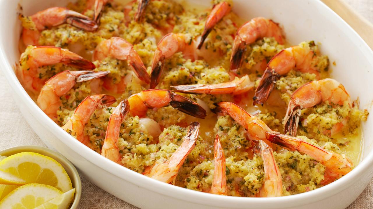
Food Network does a good job of keeping the recipe simple and easy to read. The ingredients are on the left, and the instructions are on the right. At the very top the website even links a video on how to make the dish.
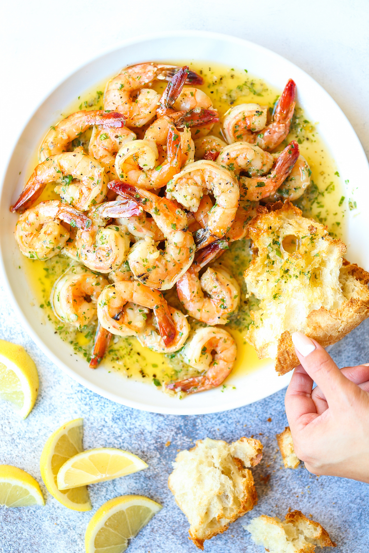
NY Times Cooking has a nice description at the beginning that tells the reader what they should be expecting. This is promptly followed by the ingredients and instructions. However, the instructions re only 2 steps, when I feel like it would make more sense to split it into more steps. This way each step isn't as bloated.
The design of Bon Appetit is very clean and easy to read. There is a very simple progression from description, to ingredients, to preparation. My only complaint with this website is that the bottom of the webpage kind of disapears to make way for an ad. It just feels kind of awkward.
I really like th animation that plays when loading this website. While I don't think I can do this for my recipe, it would be cool.
The website has a very clean and modern design ot it, that I want to try and replicate.
I enjoy the cleanliness of this website, as well as the cohesion of the many different elements.